
The year which is still mostly ahead of us hasn’t been particularly interesting so far, at least when it comes to the way the Web looks and feels. Last year, for instance, we had an opportunity to witness a big shift in Google’s design paradigm which came with their introduction of Material Design, while this year all we can do is watch this concept grow into something beautiful.
Nevertheless, even if there are no big bangs which change the way we look at the Web, there are certain trends which point us to the way in which the online world will progress. Here are some of them we considered to be the most important, listed in no particular order. Read about them and you will notice that you will begin to see them everywhere you look.

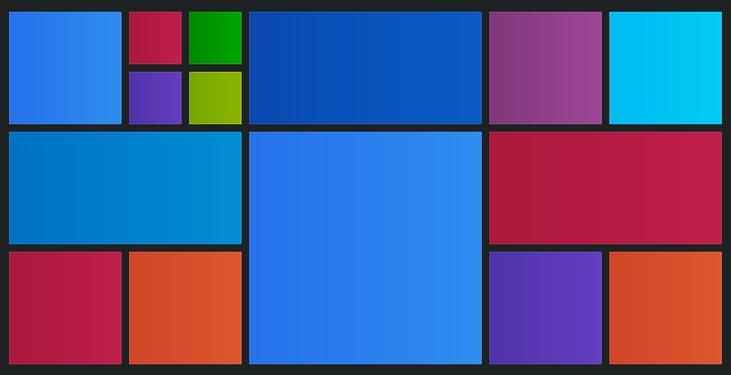
Card Interface
The aforementioned Material Design has a lot to offer in terms of clarity, vibrant colors and slickness of animations, however, we think that the feature that will last longest is the card interface – the bits of information organized and presented in an accessible way which places them front and center.
It’s obvious that websites all over the world are gladly adopting this approach (particularly for their mobile versions and apps). This is partly out of wish to fit their content into the Android ecosystem (with 5.0 Lollipop, Google is all about Material Design), but also partly because card interface really looks cool.
The Future Still Looks Flat
When computers got the opportunity to feature graphic interfaces for the first time, their ability to produce beautifully looking screens was pretty limited, This is why designers constantly struggled to achieve a beautiful look by adding 3d effects and shadows.
Today, designers feel that there is no need to pretend that the Web is anything other than what it is. The flat design movement, popularized by Apple in the past couple of years, is web design at its most elegant. It lets content shine by reducing design elements to a subtle but elegant minimum.
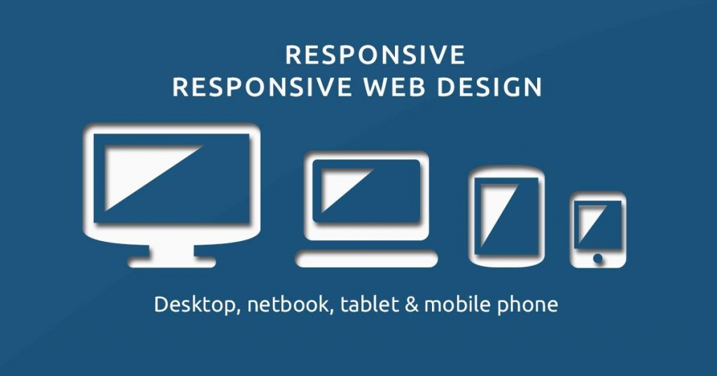
Responsive ‘responsive design’
Responsive design, another web design trend which originated as a part of the ongoing effort to create websites which look good on all sizes of devices we use every day, is also here to stay. Not only because it is just too important to go away, but because the need for it is bigger than ever.
Wearables like smart watches introduced extremely small screens which still need to present some information and look good in the process. Responsive design now needs to find a way to become even more responsive.
People Like to Scroll
When the action of scrolling stopped being as irritating as it used to be with our scroll buttons and touchpads and started actually being fun (swipe if you agree!), web designers everywhere decided to go with the flow and give people what they want and then some (parallax scrolling is so awesome!).
But if it was only scrolling for the sake of scrolling, the fad wouldn’t have lasted this long. The fact is, once people start thinking it is ok to look for the information elsewhere on the page, not just at the very beginning of it, this opens a lot of possibilities to present the information on the website in a clearer, less cluttered and more logical way.